Blick
Designing a smoother path from inspiration to creation.
Blick Art Materials is a trusted name among artists, students, and educators but its digital experience hasn’t kept pace with today’s expectations. Blick’s existing website feels cluttered, dated, and inconsistent across devices, with no dedicated mobile app. My redesign reimagines Blick’s online presence to be modern, intuitive, and visually inspiring to bridge the gap between retail function and creative exploration. This is an on going project as I refine flows, test prototypes, and expand the redesign to include mobile app development, print resources, and a line of Blick apparel.

About the Project
This redesign began as a personal project inspired by my and my design school peers own experience navigating Blick’s online store. As long-time supporters of Blick and frequent users of its products, we often found the process frustrating and outdated despite our love for the brand itself. That tension became the foundation for this case study: a self-initiated effort to reimagine how Blick could better serve students, educators, and working artists through a more intuitive, engaging, and community-centered digital experience.
Solo Project Role: UX/UI Designer Duration: In Progress Tools: Figma, Illustrator
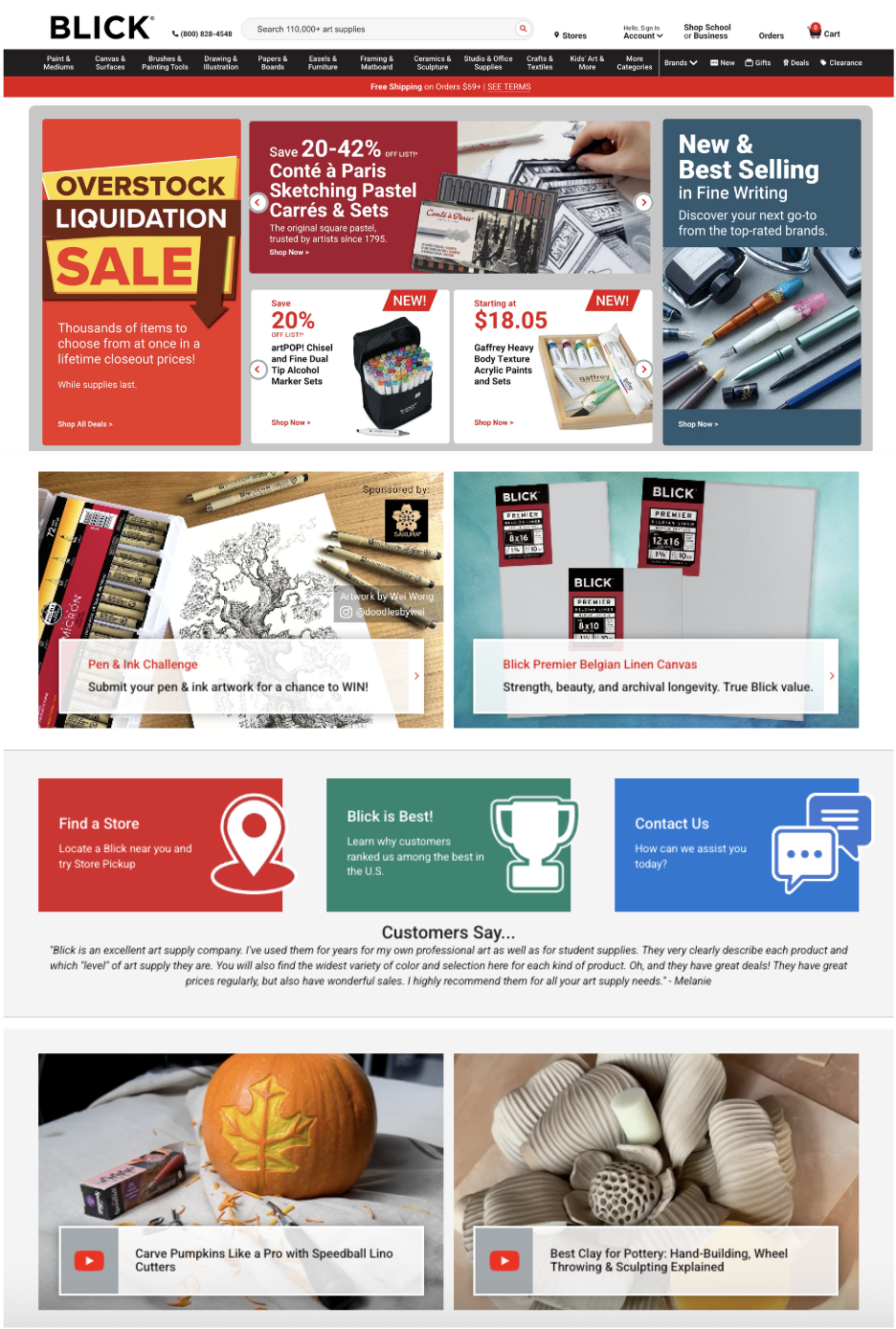
Blick’s existing website doesn’t align with the creative audience it serves. Artists are highly visual people who depend on clear hierarchy, space, and visual rhythm to process information. The current site’s dense layout, constant pop-ups, and dated imagery make discovery feel jumbled and overwhelming, especially when users are seeking inspiration, not just supplies.
My redesign introduces an editorial sensibility: structured grids, generous whitespace, and curated visuals to transform the experience from a utilitarian store into a clean, inspiring digital studio where creativity feels supported, not stifled.
Understanding the Problem
User Archetypes
These archetypes represent the core audiences who rely on Blick for creative materials. Together, they illustrate the spectrum of Blick’s user base, from students seeking affordability and speed, to professionals prioritizing efficiency and quality, to hobbyists looking for inspiration and guidance. Designing for all three ensured the redesigned experience was inclusive, intuitive, and adaptable to different creative workflows.
Professional Artist
High-value purchases, bulk orders, needs advanced filtering & reordering.

Hobbyist
Seeks guidance, tutorials, and inspiration; easily overwhelmed by cluttered interfaces.

Student
Price-sensitive, needs quick access to class kits and shipping deals.

User Archetypes
These archetypes represent the core audiences who rely on Blick for creative materials. Together, they illustrate the spectrum of Blick’s user base, from students seeking affordability and speed, to professionals prioritizing efficiency and quality, to hobbyists looking for inspiration and guidance. Designing for all three ensured the redesigned experience was inclusive, intuitive, and adaptable to different creative workflows.
Translating research and insight into a clear direction.
Project Statement
Blick’s online experience undermines its core strengths by prioritizing inventory over usability. Users can’t easily find what they need or explore what inspires them.
Design Goal
Reinvigorate Blick’s digital presence through a streamlined, editorial interface that simplifies browsing, enables discovery, and cultivates purposeful inspiration.
Blick’s brand is already bold and recognizable. My approach modernized rather than reinvented. I maintained the signature red-black palette while introducing more white space, editorial typography, and structured grid systems. The goal was to make the site feel both energetic and organized.
I developed modular components that can extend into print and merchandise, creating a flexible ecosystem beyond the website.
Visual Direction & Brand Update

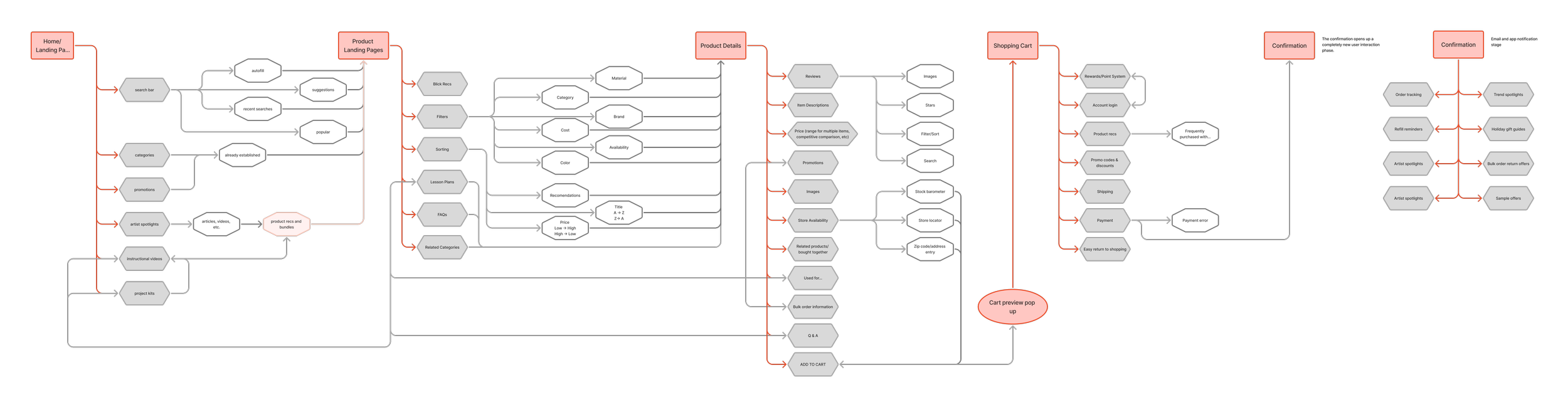
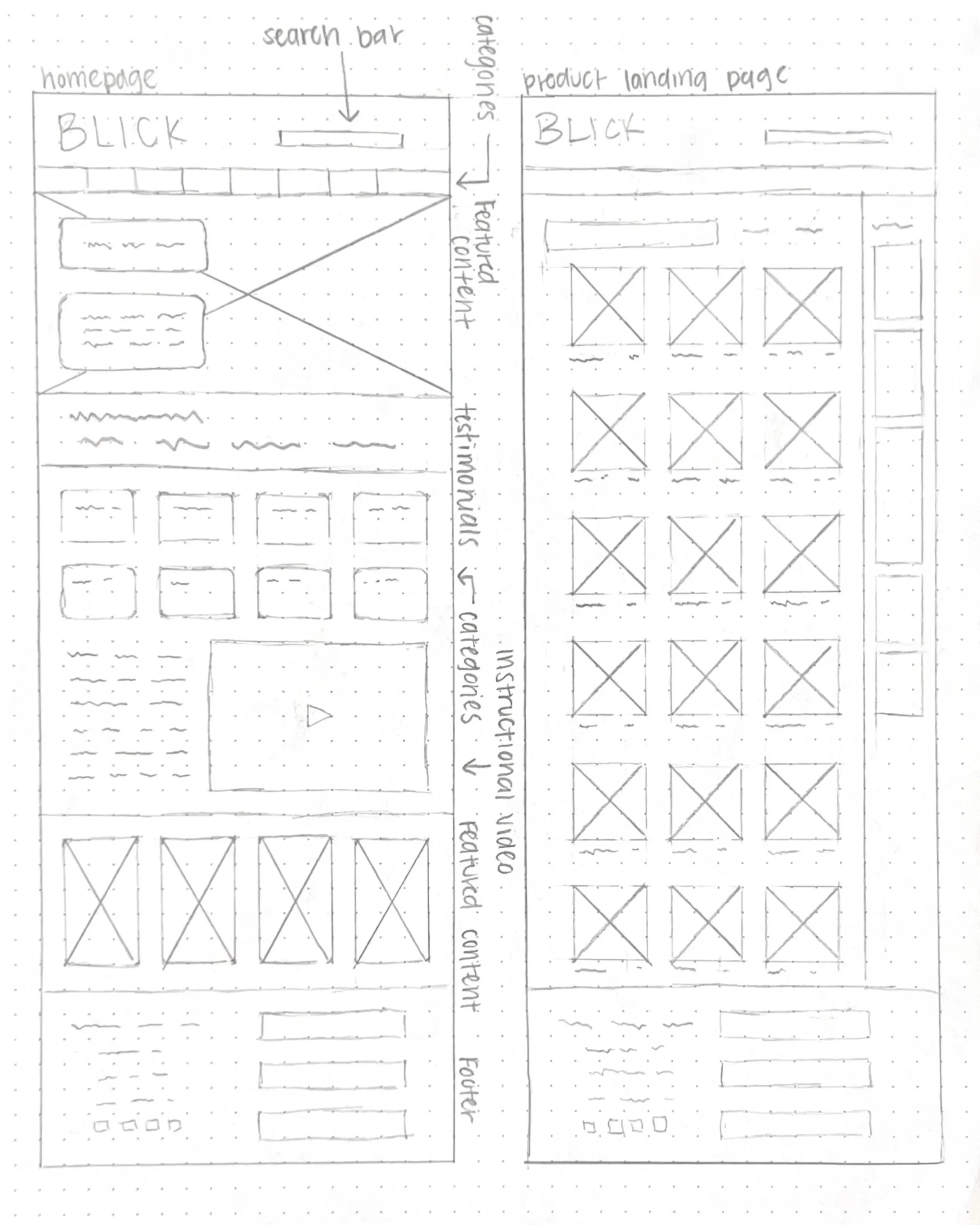
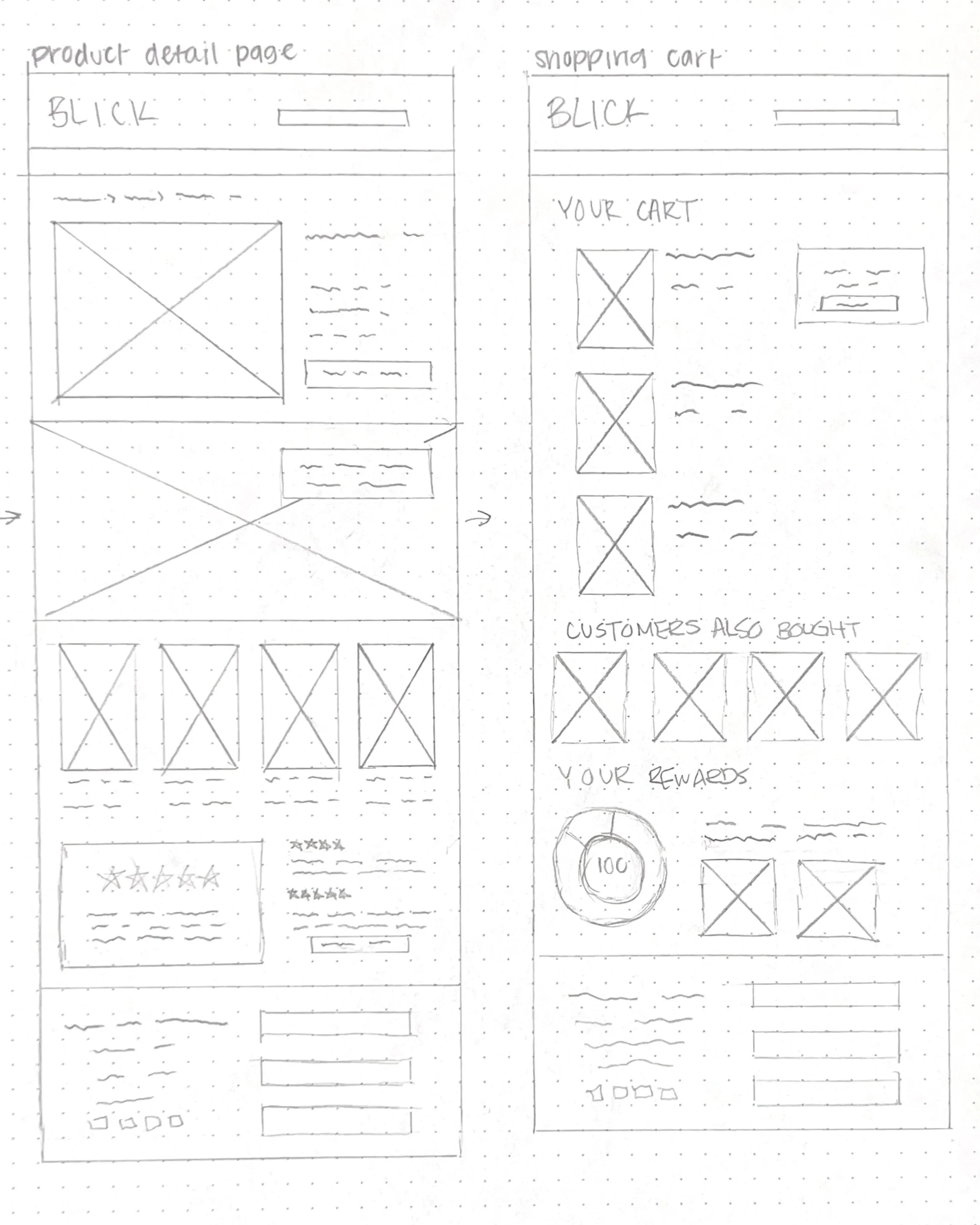
Before developing the high-fidelity interface, I created detailed wireframes to define the site’s structure and hierarchy. My focus was on reducing visual noise, clarifying navigation, and establishing a consistent rhythm across pages. Each wireframe explored how users could browse, discover, and purchase with minimal friction, laying the foundation for the clean, editorial layout that guided the final design.
Wireframe Design
The redesigned interface emphasizes clarity, visual rhythm, and an editorial feel that resonates with Blick’s creative audience. Every page was built around structured grids, generous spacing, and refined typography to reduce clutter and improve legibility. By pairing large, inspiring visuals with simplified navigation, the new design turns shopping into a visually engaging, intuitive, and explorative experience that mirrors how artists naturally browse.
The Interface

The Website Landing page highlights the monthly Artist Spotlight, weekly lesson plans, featured categories, and new sale items.
Product Landing pages list all product types and allow user to filter and sort.

The Artist Spotlight is a monthly published article describing the artist practice of a chosen Blick creative. This page allows users to read about a creative practice and shop the artists’ favorite materials.

Product Detail pages list all product size, set, and color options. This is where users make their secretions and add products to their cart here.


Cart Summary page summarizes user selections and encourages users to restock items that they have purchased recently or that they purchase repeatedly. Account holders can also see a summary of their rewards status.


Various pages in their scroll states with a condensed header.
View each page in Figma:
Blick Rewards
Blick’s current loyalty model centers on immediate savings rather than long-term rewards. The Preferred Customer program offers in-store shoppers Web Match Rebates, ensuring they pay the lowest total price compared to Blick’s website. Additional perks include a Lowest Price Guarantee and a 10% academic discount for students and educators.
While effective for cost-conscious shoppers the system is purely transactional, there’s no point accrual or incentive to stay engaged beyond saving money on individual purchases.
Old System

To build deeper loyalty, I restructured the program into a three-tier points-based system inspired by a primary color palette. The new design introduces Yellow, Blue, and Red tiers, representing artistic growth from curiosity to mastery.
New System
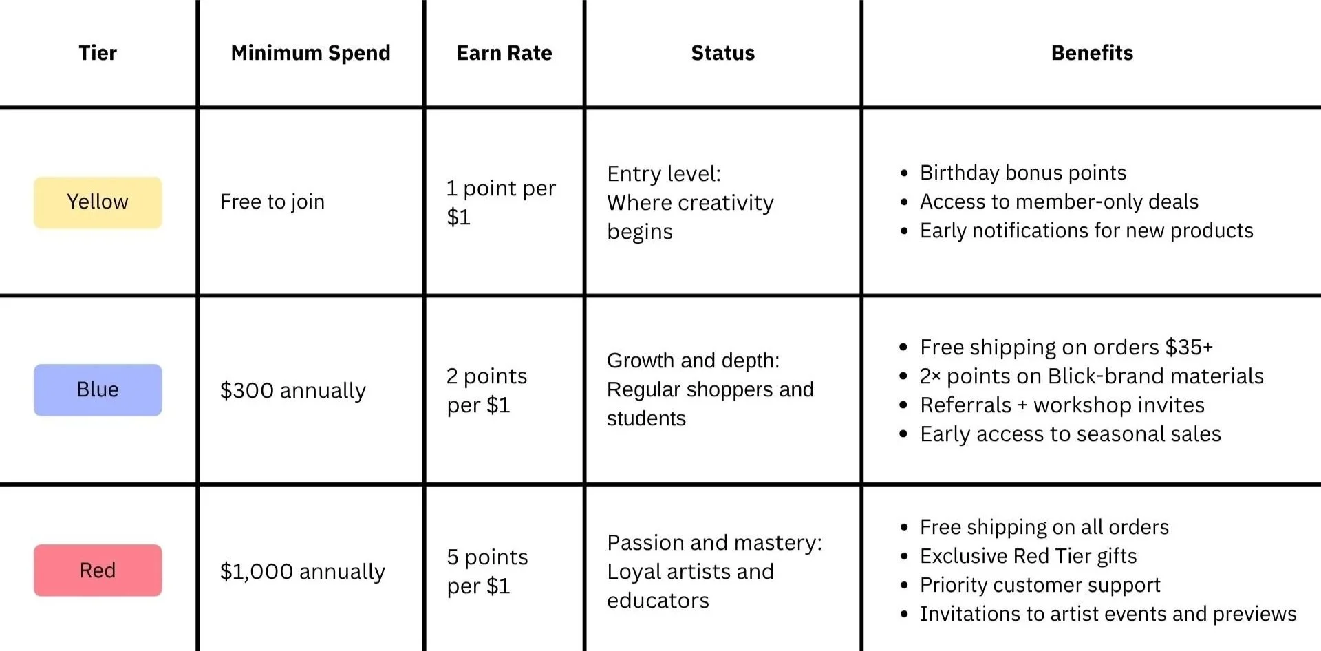
This redesign shifts Blick’s loyalty model from price matching to experience building.
Members now earn points through purchases, reviews, and referrals. These point can be redeemed for store credit, free shipping, and exclusive access to artist workshops.
The color-based progression transforms the transactional “Preferred Customer” program into a vibrant, motivational system that celebrates artistic progress and strengthens brand connection across Blick’s in-store and digital platforms.


The redesign positions Blick as a modern, intuitive platform that still honors its legacy. By simplifying navigation and integrating editorial content, the new experience balances commerce and creativity, turning a utilitarian site into a destination for purposeful inspiration.
Impact
This project strengthened my ability to translate brand identity into scalable digital systems. It taught me how small structural changes such as cleaner hierarchy, responsive consistency, and meaningful storytelling can completely reshape user experience.
Next, I plan to extend the redesign into a mobile app companion and build supporting print + merchandise mockups, completing the cohesive Blick ecosystem.
Reflections & Next Steps
